Visa Brand Evolution
Category: Event branding · Executive keynotes · Scalable systems
Role: Design Lead/ Producer, Creative Direction
Agency Partner: Mucho
(Re)Introducing Visa
to the world
During my role as Global Design Director, Visa began a multi-year, company-wide effort to transform the brand: shifting perception from being known as: “A trusted credit card company” to “The trusted payment network providing access to the global economy.”
As part of the Global Brand & Creative team, my role was to
lead brand design refresh and
unify Visa’s design ecosystem
across the entire organization to support the new corporate growth strategy, expanded audiences, and brand relaunch.
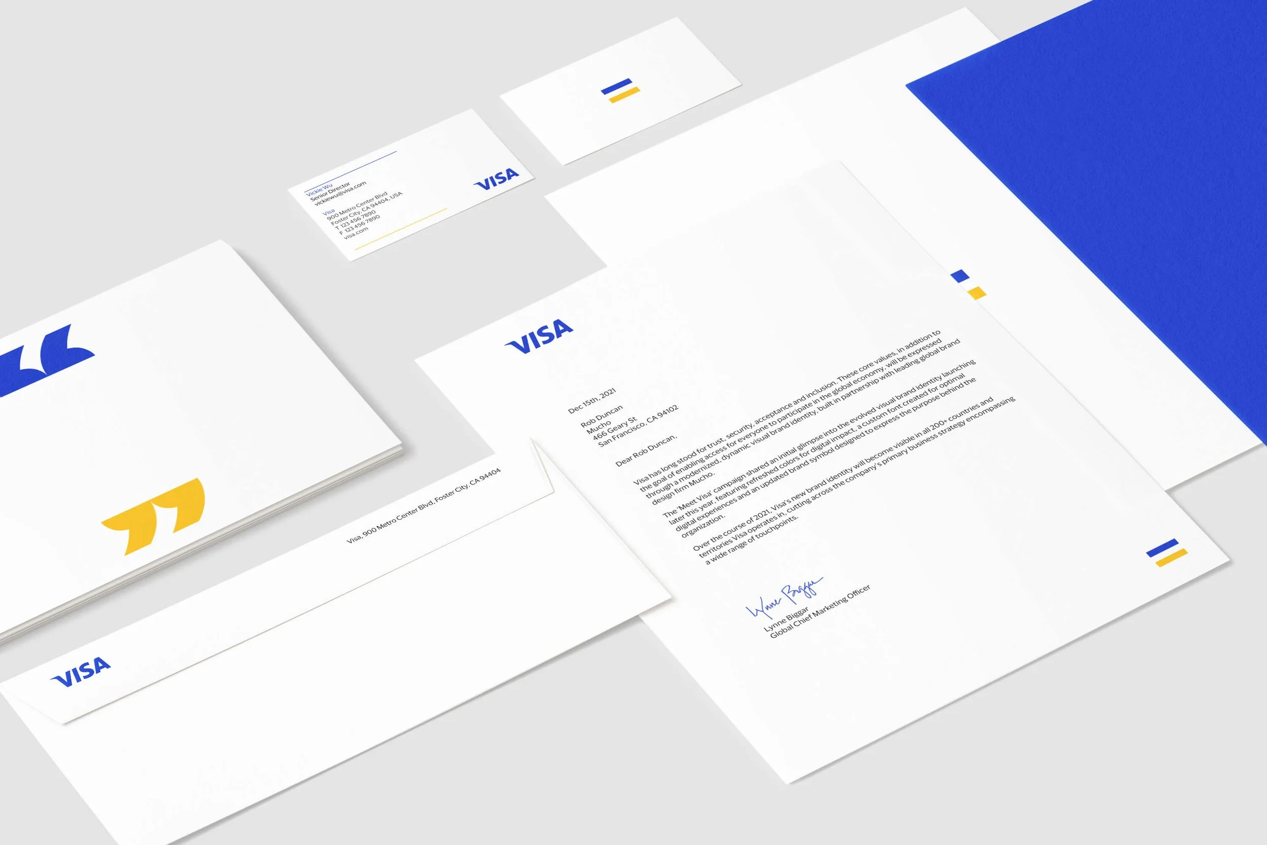
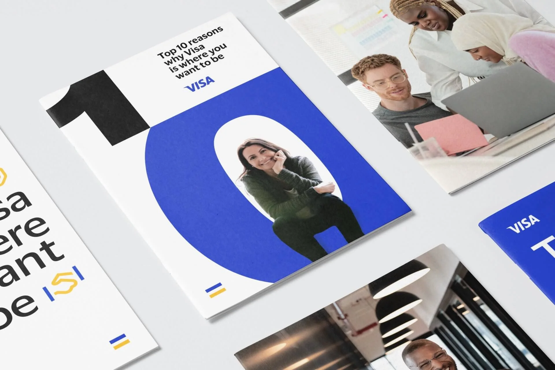
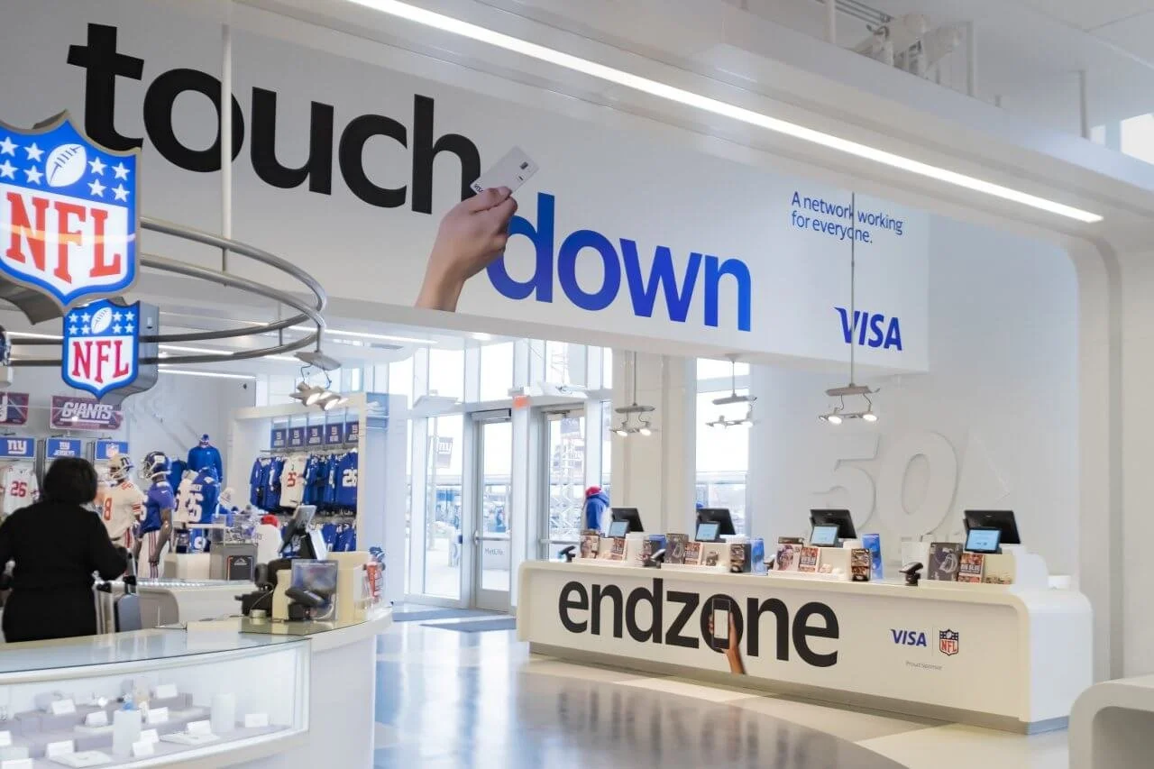
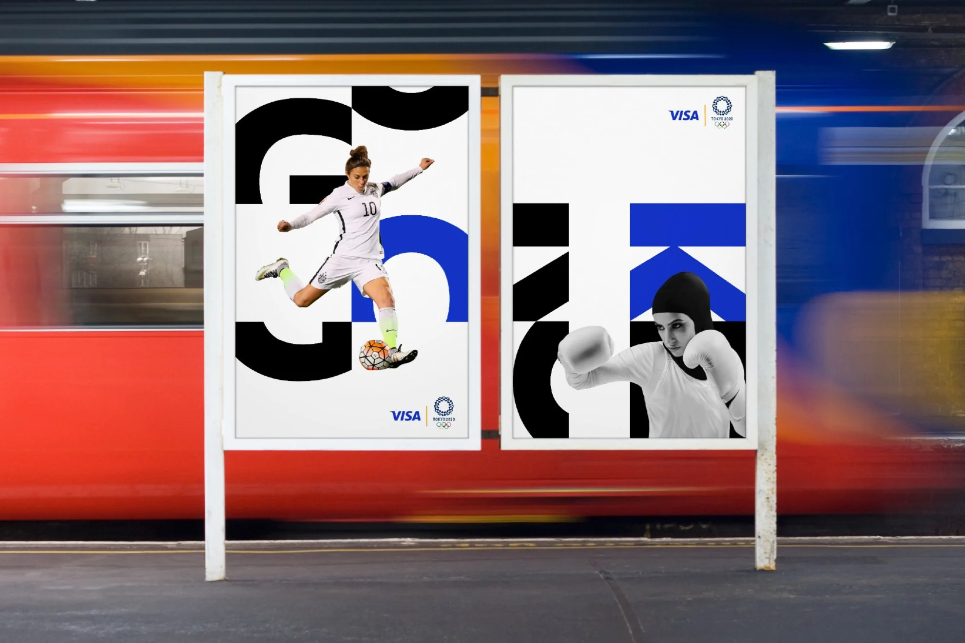
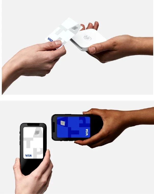
Brand Mark Evolution:
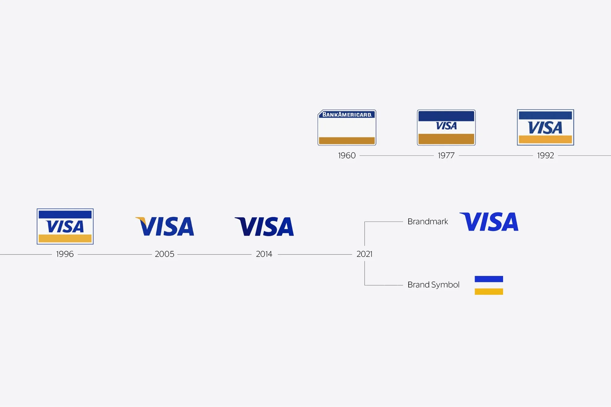
Symbol of change
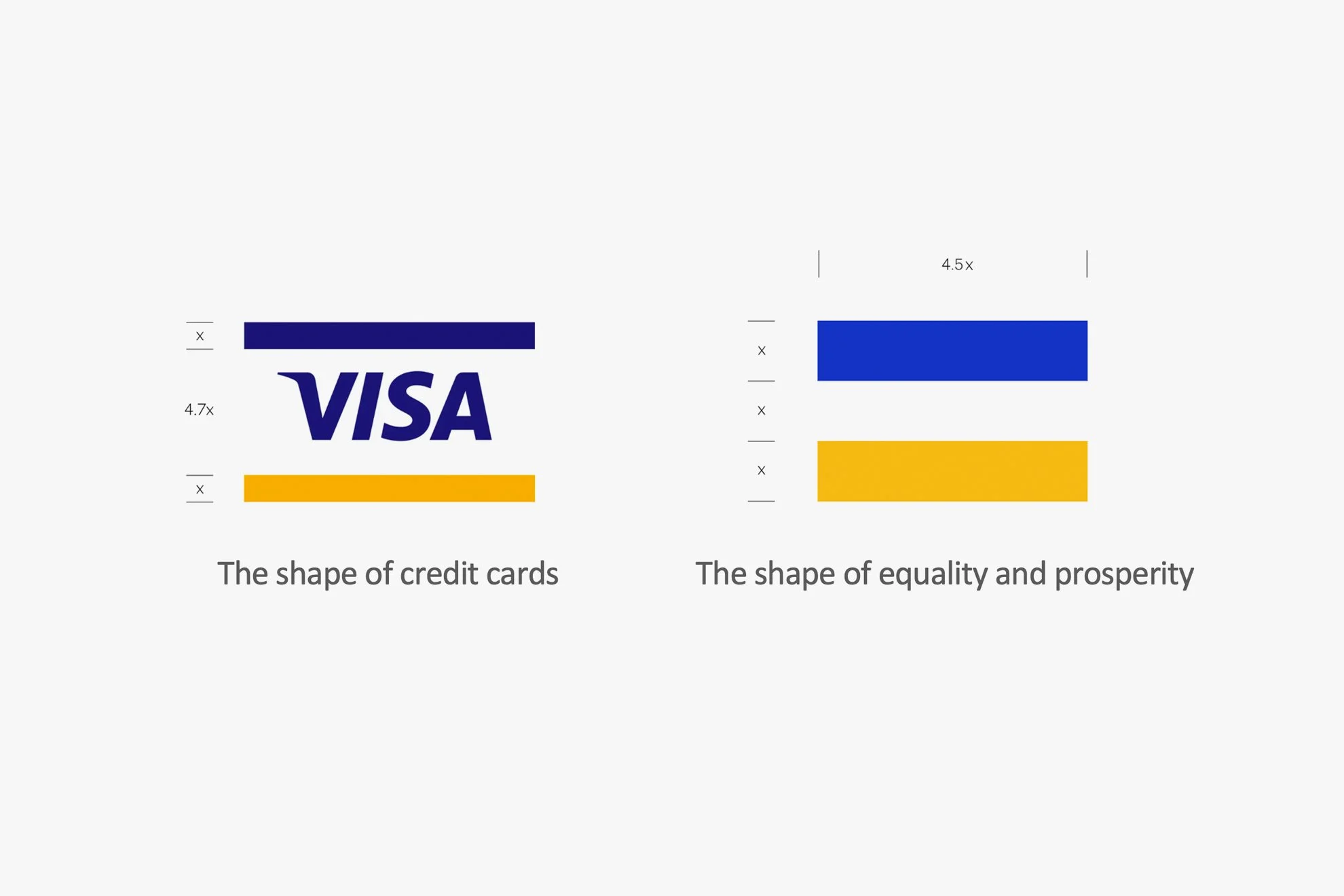
A core part of the new identity was honoring the Visa visual heritage and to elevate the brand as a purpose-driven brand.
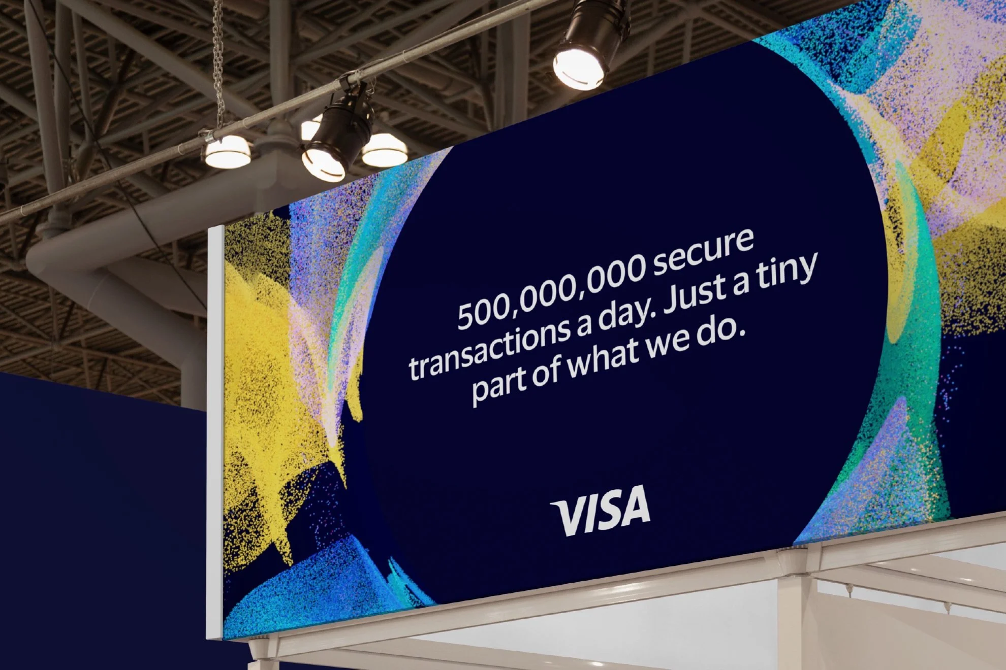
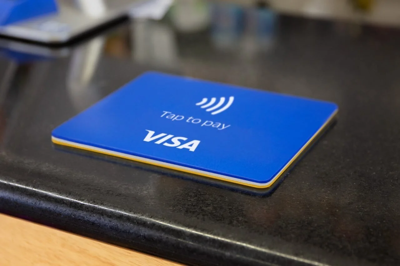
Brandmark: We updated the brandmark to a new brighter blue, signaling future-leaning change and dynamic momentum of the brand.
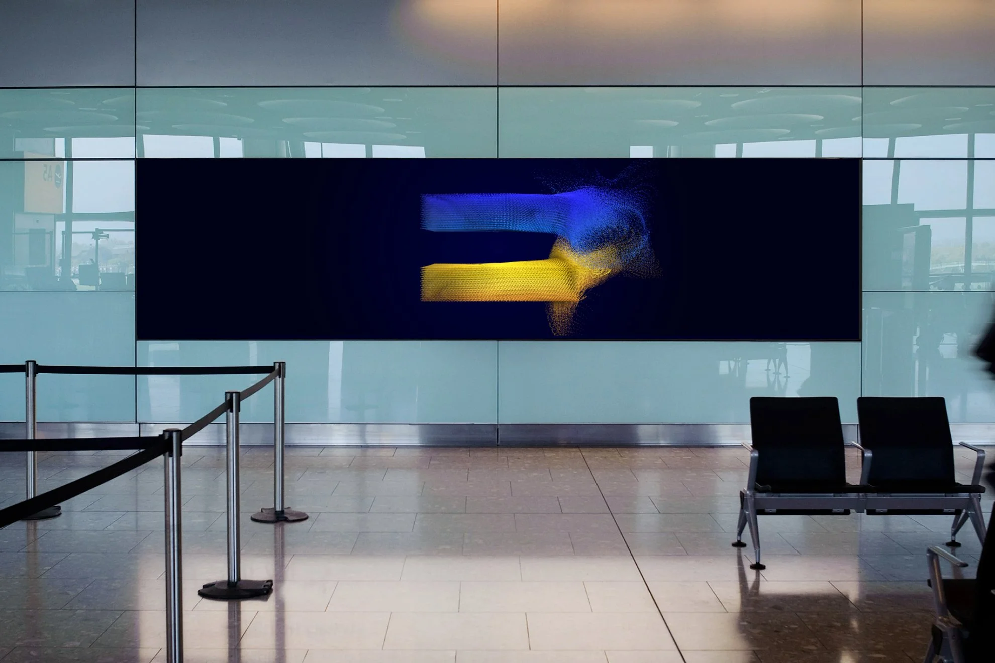
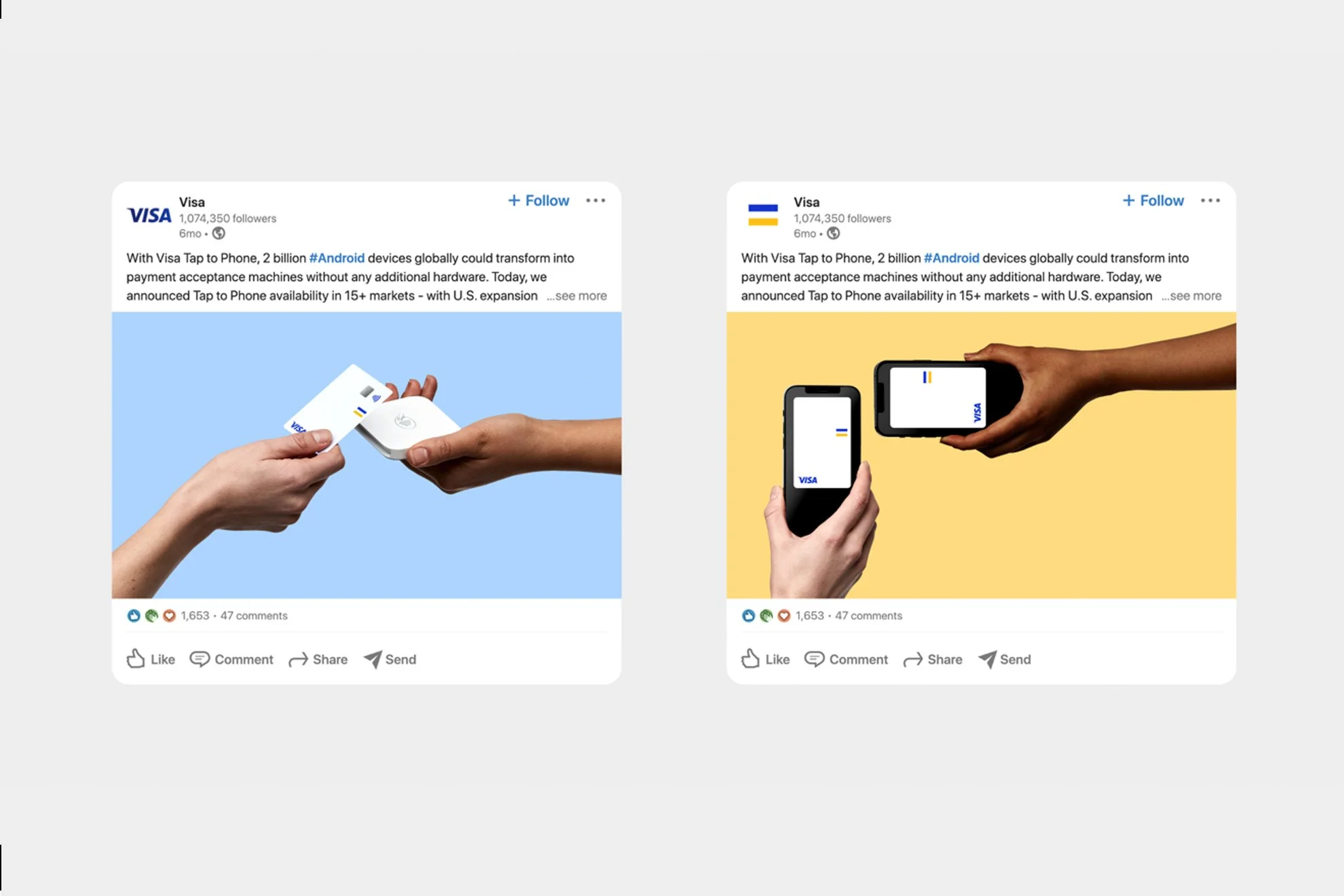
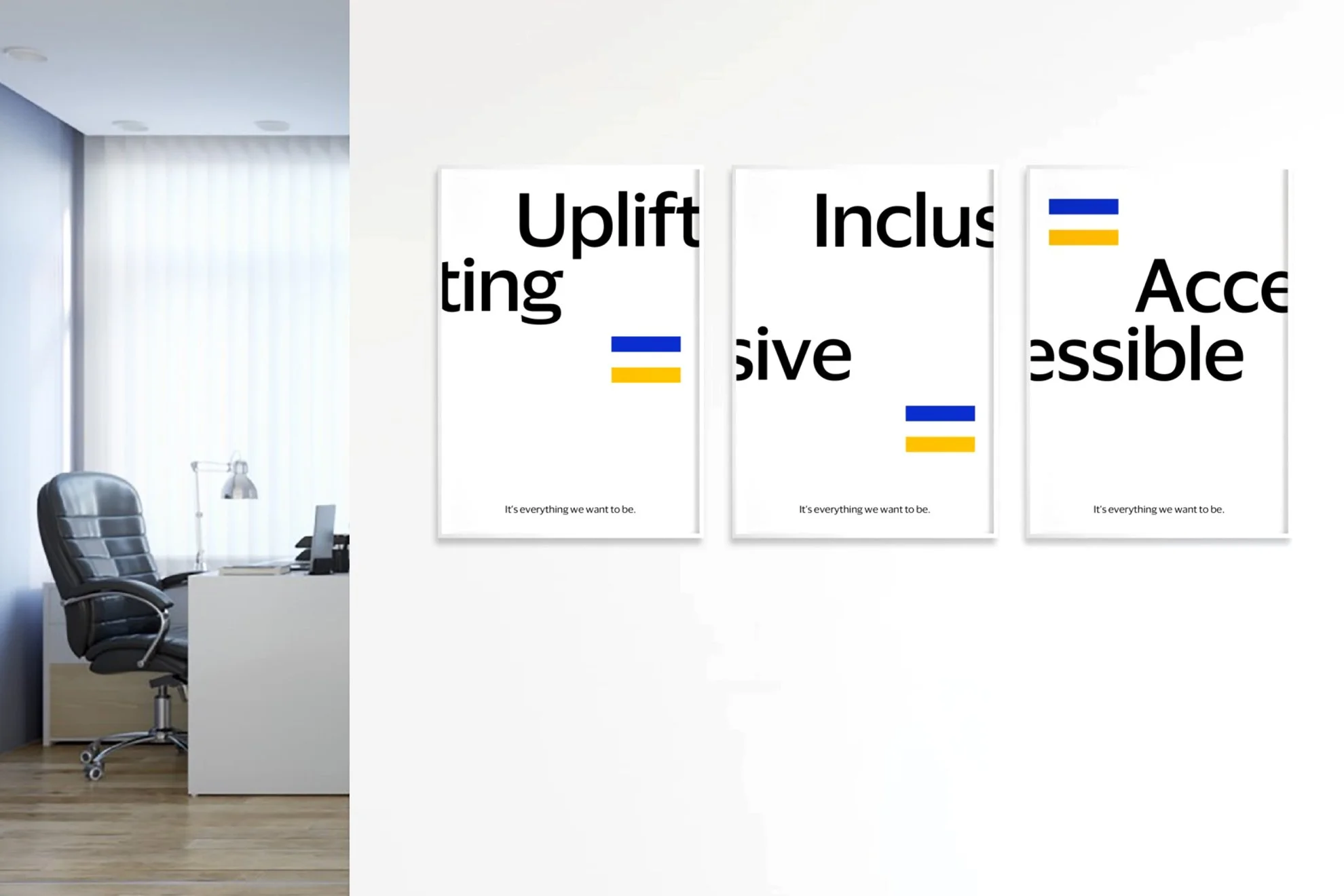
Brand Symbol: The brand symbol is inspired by the past and represents the purpose-driven brand message of access, equality, and inclusion.
One Color Palette
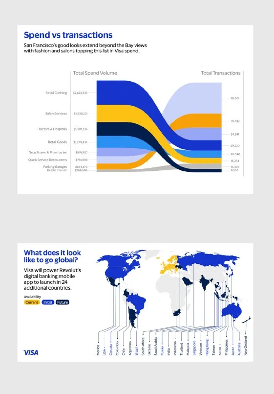
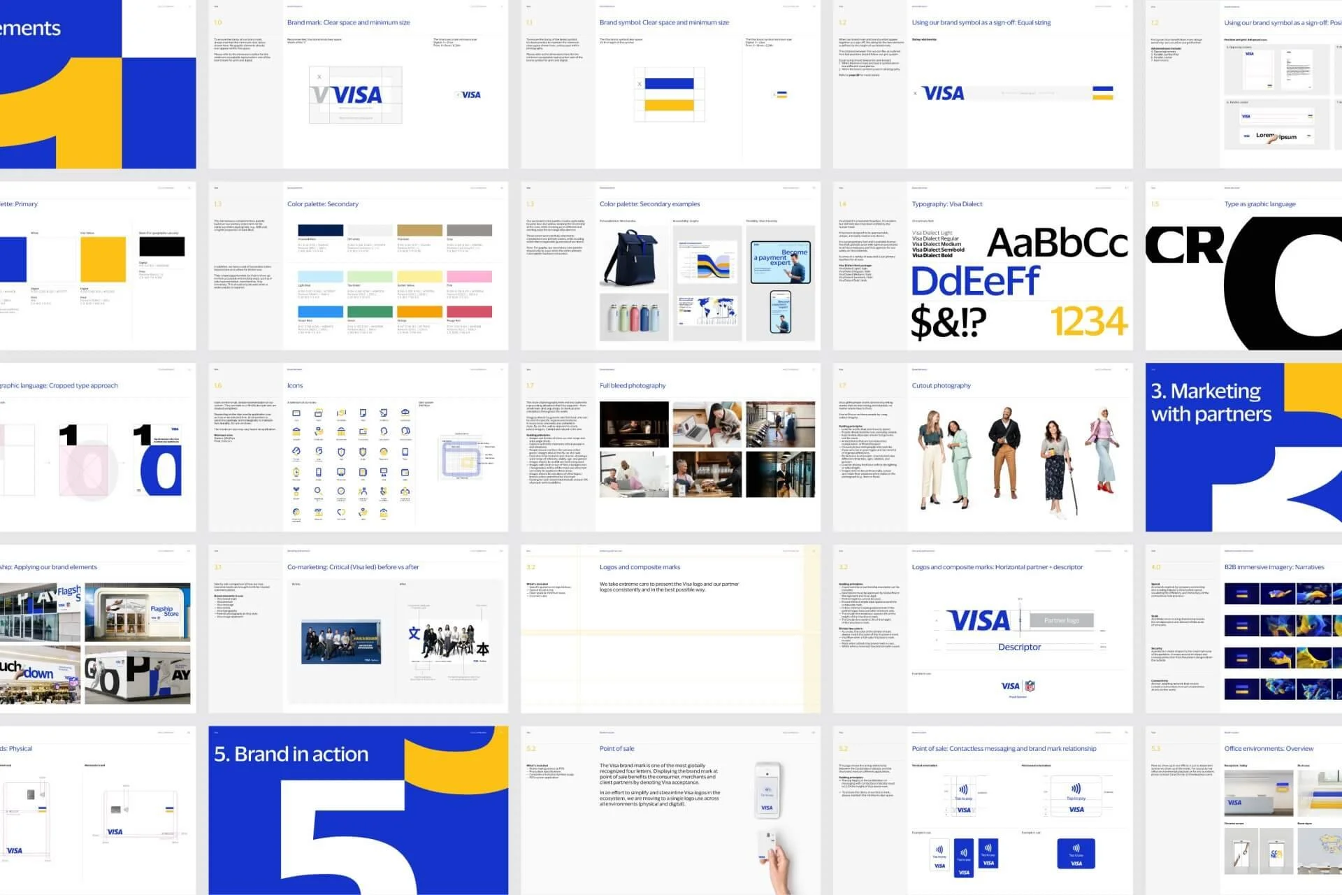
We unified multiple color palettes across the organization, audiences, and channels into one cohesive color system for everything Visa.
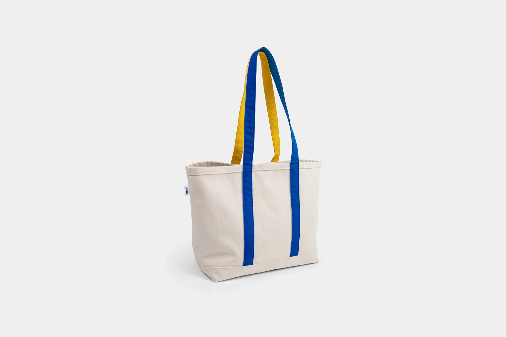
We brightened the iconic Visa blue & yellow to reinvigorate and modernize the brand. To support the expanded target audiences, we expanded the secondary color palette. It keeps the Visa brand at the core while showing up in different and exciting ways for a range of audiences, from B2C to B2B to Government.


Typography
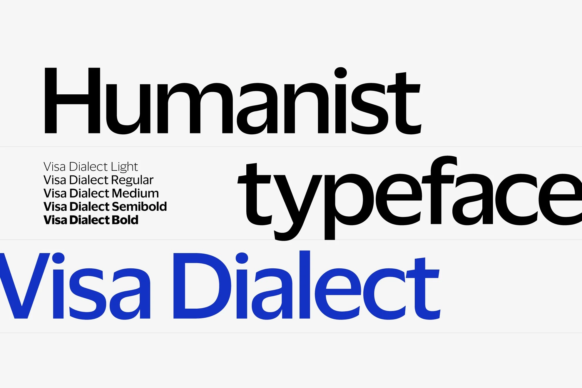
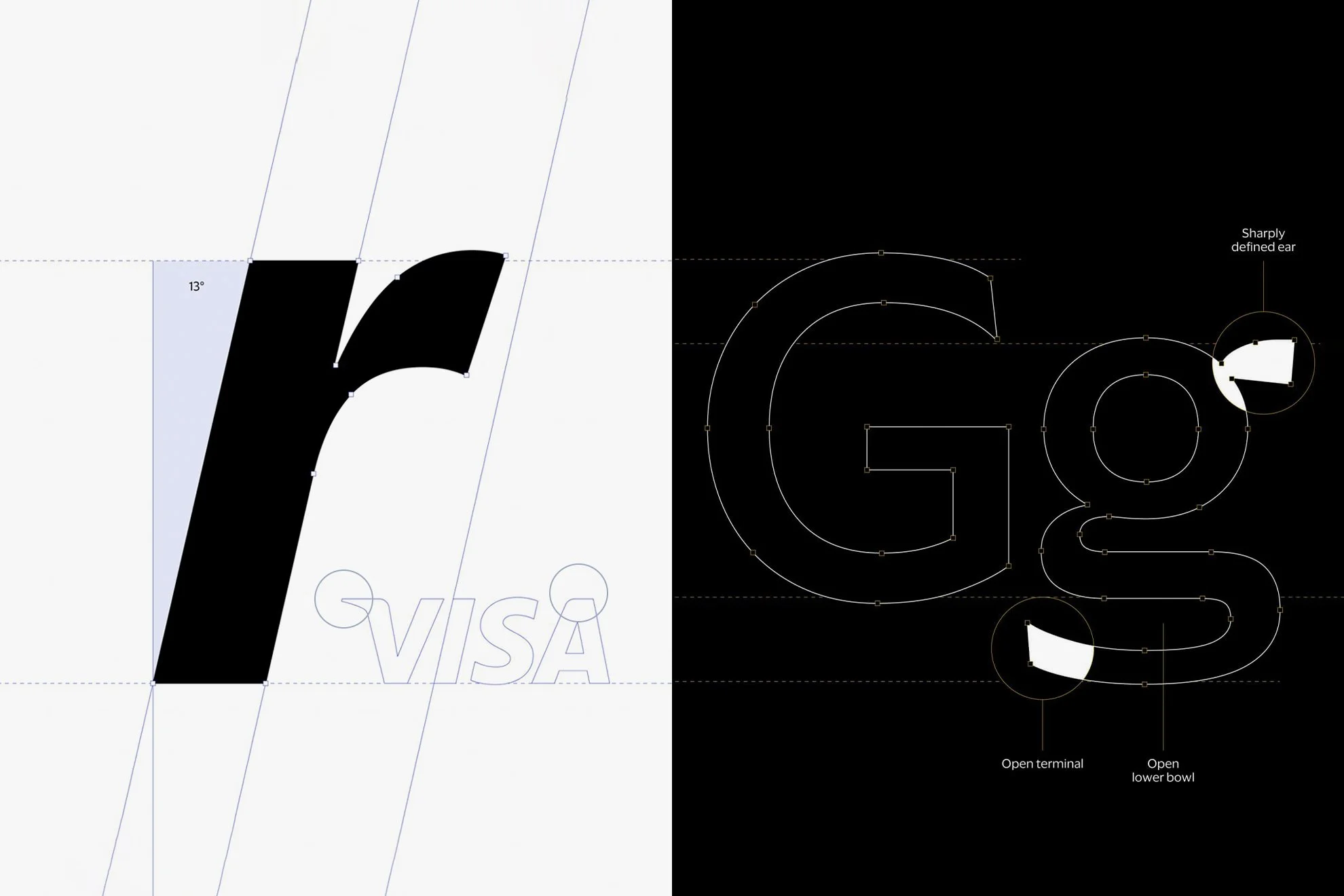
I am especially excited about creating the first-ever Visa proprietary typeface. Visa Dialect is a contemporary and humanistic typeface that works great across both print & digital platforms.
The use of the ownable typeface pushes brand recognizability and builds awareness.
Photography & Imagery
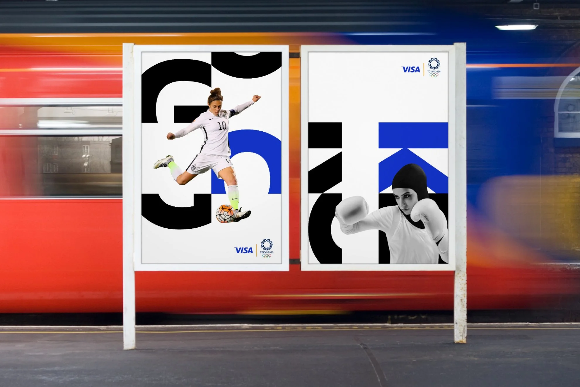
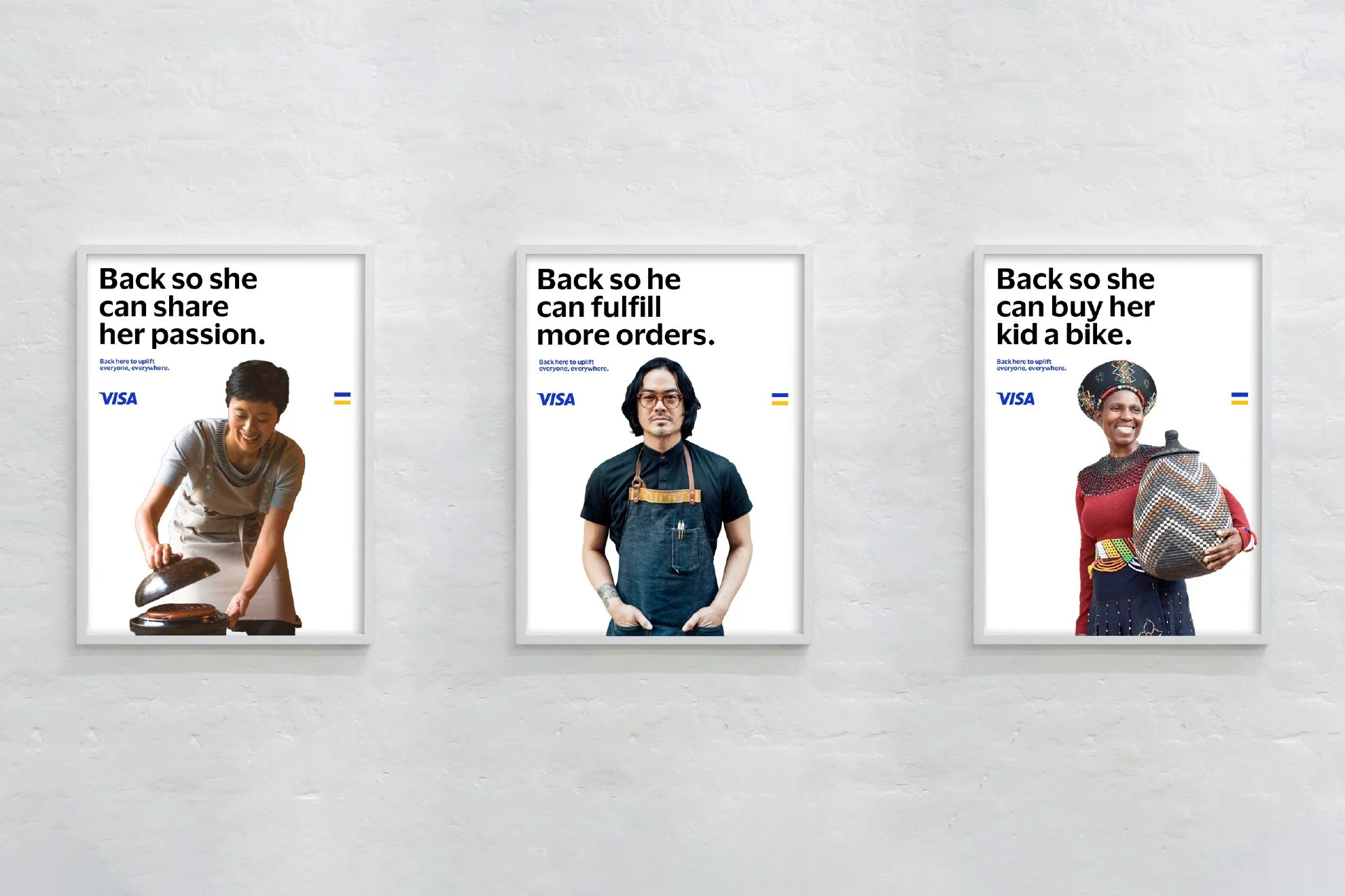
As a company advancing human economic progress, Visa's new imagery direction is future-leaning, innovative, and inclusive. This means we include people from different backgrounds, cultures, and identities.
The new approach demonstrates our commitment as a purpose-driven brand, being uplifting, accessible, and inclusive.

Icon and illustration system
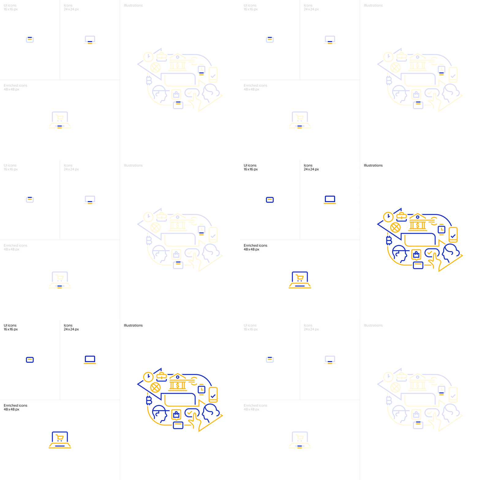
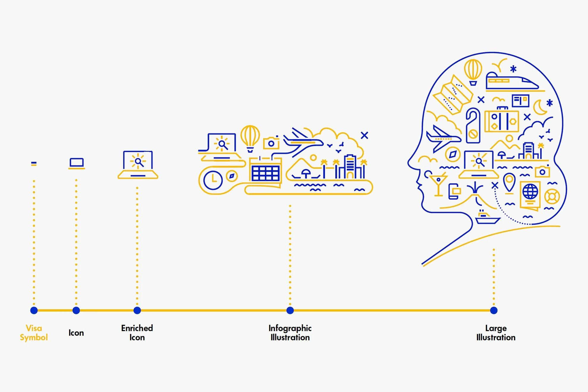
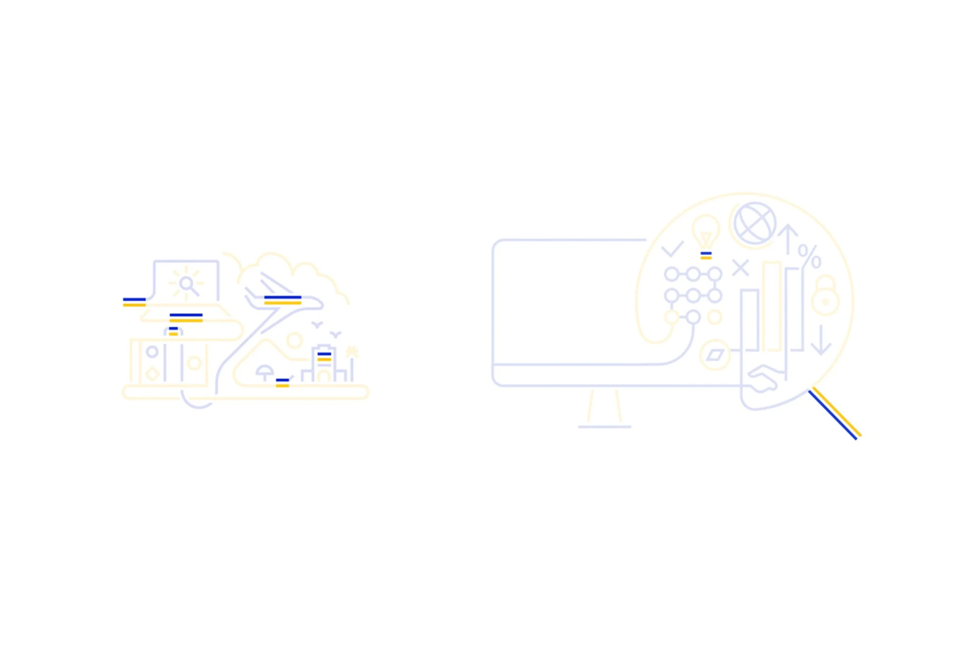
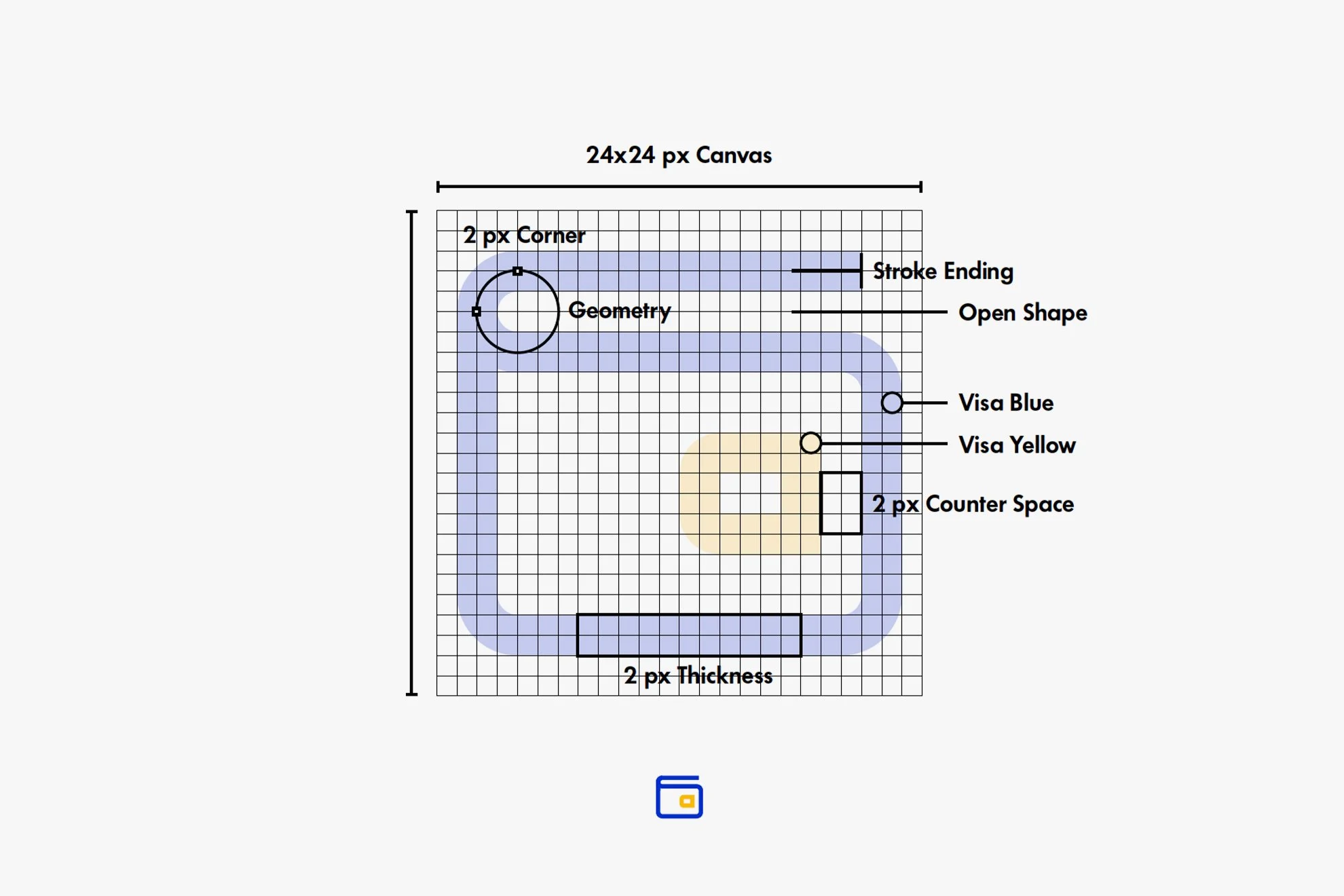
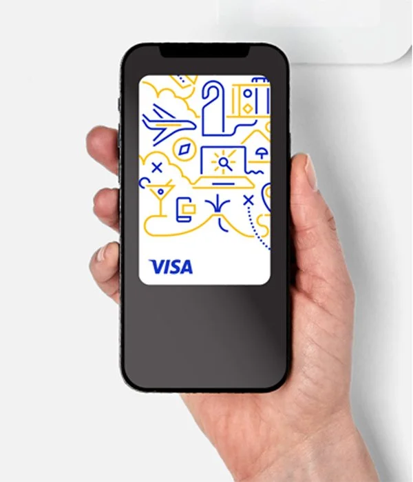
Using the brand symbol as the foundation, we extended the iconic color ratio into a unique icon and illustration system.
The new line style icon and illustration visually symbolize Visa’s role in connecting and enabling people and money movement, anchoring back to our new brand strategy.